Friday, December 13, 2013

3rd Marking Period


21A
For this assignment I used the software " sketch-up " and used the square and circle tool to make two out of the three shapes, and used the pencil to make a triangle.


21B
For this assignment I just used the " push/pull" tool to make the objects look 3d.
21C
For this assignment I used the pencil tool to write four out of the five letters of my name. Then I used the circle tool to make the "o" of my name. And last but not least I used the " push/pull" button to make it look 3d.
22-1
For this assignment I used the length of 8' , Width 5', but the two little squares have a measurement of 2', and height of 5'.

22-2
Length:8' , Width:5', Height:4'. The middle opening has a a length of 6', and the block on top of it has a height of 2.5'.

22-3
Length:9', Width:4', ( the two blocks that are blue have a width of 2'), Height:6'.

22-4

Length:7',Width:6',Height:4'

22-5
Length:8',Width:5',Height:5'

22-6
Length:8',Width:5',Height:6'
22-7
Length:8',Width:5',Height:6'
22-8
Length:9',Width:5',Height:6'

22-9
Length:9',Width:4',Height:6'
22-10
Length:11',Width:3',Height:6'

22-11
Length:8',Width:5',Height:6'

22-12
Length:9',Width:2',Height:6'
QUIZ
Length:10',Width:4',Height:5'

For assignments 1-12 and the quiz I used the same steps for each. First I used the rectangular tool to create a rectangle. After I use the measurement tool to create the length of each length,width,and height. For each assignment there are certain cuts and twist is not just a regular block. To make those I just use the pencil tool to create the measurements of the blocks inside the original block. In some we have to make a slope. To make the slope you just connect two diagonal dots. This is the basic summary  to create each block. Some are a little more specific but they all undergo the same procedure.
Assignment #23
For this assignment I searched for a gingerbread house I liked. I try my best to make it as much similar to it as possible. First I did the dimensions of the house. I then started added the designs as it looked on the original gingerbreadhouse. To make the the white parts more of a snowy look I used the push up tool, i also used that tool for the windows. Another handy tool I used was the free hand pen tool, that made the snow seem a little more real. And I just kept adding designs to create my copy of the original gingerbread house.


Assignment #24
For this assignment I took my version of the gingerbread house and transported it to Photoshop. I searched for a Christmas themed plate/table and pasted my gingerbread house to the plate. After I changed the color effects to make my house look 3d when you have the appropriate glasses :)

Assignment #25
For this assignment I first created a circle and searched for the power sign and attached it to my circle. To create the silver looking circle I created a grayish to white gradient effect and then added a radial blur. Then I added green inner shadow, outer glow, inner glow, and gradient overlay. Then to create the animation i went to window->animation to create my glowing button :). 
WHAT IS GIF? HOW DOES ANIMATION WORK?
A GIF is a format for compressing image files. GIF is an acronym for Graphics Interchange Format. Animation is made of a series of still images, or played in a sequence using a computer program such as Photoshop.Animation creates a movable computer generated view.
Sources: techterms.com,wikepedia.org,ehow.com
Assignment 26
For this assignment I had to create sort of a 3d room and add a gradient effect to create this feature , then create " spotlights" by using the ellipse tool to create the circle and add different effects as said in www.photoshop-plus.co.uk/2011/09/21/learn-how-to-create-your-very-own-showcase-room/#more-648. Then i searched for shoes that are trending now, and added them to my room , the front , side and back view. Then i added a light pink color to my bank ground and thats it :)

ASSIGNMENT #27


This is my last piece for this blog. This brochure summarizes my everyday routine at school. I used publisher to create my brochure. I added a photo to each section to summarize the class in a picture. This is my Brochure :).


Thursday, October 17, 2013

2nd Marking Period

#11:Flyer redesigned by Noemy Espinal

For this assignment I used Photoshop to create my flyer. On Photoshop I used the Glass text effect on the "Noche De Ciecias" text. I changed my Blending Options,Drop Shadow, Inner Shadow, Outer Glow,Bevel and Emboss, Contour, and Color Overlay styles according to the tutorial posted on http://www.tutorialboard.net/photoshop-glass-text-effect/. I also created the background by adjusting the style option to gradient overlay.In this case I used the colors light blue to white.Then I added the 5 W's, ( who,what,where,when, and why) as text. I also included some pictures that had to do with the science theme. I copied it from google images, and pasted it on the flyer.For the picture that says " Science Rocks ! " , I added an effect. I tried to make the picture stand out by using the magic wand to erase the white areas around the picture, and i added purple instead on the back of the text by using the outer glow option so that the picture can stand out more. Finally I added the information about this event on the bottom. :)

ASSIGNMENT #12

For this assignment I first searched a color floral dress. Then I searched for a colorful abstract texture. To transfer the abstract material I used the magnetic lasso to select the whole dress. To customize my dress I chose my own color dodge as the layer model. For the last step I then lowered the texture layer opacity level and I completed my dress.

                                                                          ASSIGNMENT #13
   
   For this assignment I used the poster from foodbanknyc.org as an inspiration for this assignment. I first looked for a picture of McDonalds fries, and a small pile of slices of apple. I first chose a solid pink as my background. Then I copied the McDonalds fries. Then I used the magnetic lasso tool to select the fries and delete it and put the apple on top of the carton to make it seem like instead of choosing fries your choosing apples ;). To give the finishing touches I chose the outer glow from the blending options and made it more scatter to make it seem like the pictures stand out. Last but not least I had to include the benefits of choosing apples instead of fries. And the benefit is that apples help regulate blood sugar. By the way The NYC FOOD BANK LOGO was used solely for educational purpose. NO COPY RIGHT INFRINGEMENT WAS INTENDED.

ASSIGNMENT #14
For this assignment I searched for a pumpkin. I enlarged the size of the pumpkin to work better with the picture. I had to use the magic wand tool to delete the outside of the pumpkin from the picture. Then I followed the steps from http://www.adobetutorialz.com/articles/3011/1/Happy-Halloween-Ideas  to do my "scary" pumpkin. I carved the eyes,nose,and mouth by using the pen tool and selecting my desired shape. I selected the following styles from the blending options: inner shadow, inner and outer glow,gradient overlay and stroke.

ASSIGNMENT 15A
For this assignment I first searched for an England Flag. I then looked for a brick wall. First I changed the blending mode of the flag to "hard light",  and duplicated the brick layer. Then I selected the flag and used the distort filter to displace the flag. Then i changed the blending mode of the brick picture to hard light as well. Last but not least I lowered the opacity to make both picture shown on one.


 the
ASSIGNMENT 15B
 For this assignment I did the same as assignment 15A, but instead of a brick wall, I used one of my selfies :). I first uploaded the England flag and my selfie to a new file on photoshop. And then i changed the blending mode of the flag to hard light, and duplicated the picture of myself and hit  CTRL+SHIFT+U to make it like a black and white sort  of picture. Then i selected the flag and used the distort filter to displace the flag. Then I changed the blending mode of my picture to hard light as well, and lowered the opacity of the flag to make my face visible through it. Last but not least i used the eraser tool to erase around any place that wasnt on my face, and on the eyes and around my lips and my nose. And thats how i created my painted effect look with displacement map in Photoshop in cs4.


ASSIGNMENT 16
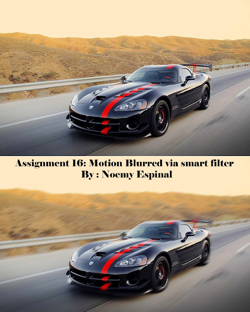
For this assignment I first searched for a picture of a car. I opened up a new file on Photoshop as smart object. Then I used the filter " motion blur " to add blur to the picture. Then I blurred out the car to make it seem like a moving car. Last but not least I added the original picture on top to see the difference between the two. :)

ASSIGNMENT 17
For this assignment I searched a picture that showed not so white teeth. Then I zoomed in to the teeth because that was my focus for this assignment. I used the quick mask button to highlight and paint her teeth. After I turned off the quick mask mode, and added white color :).


ASSIGNMENT 18:
For this assignment I used the smart filter effect. Then I added gaussian blur to the picture. Then I used a soft edge brush to point out his eyes. Last but not least I lowered down the opacity level. 

ASSIGNMENT #19
For this assignment I had to use the rectangle tool the most, to create each structure of a flash drive. I also used the ellipse tool to create the round bottom of the flash drive. Also I incorporated alot of gradient color to design my flash drive. This assignment was  basically creating each small shape of a flash drive and combining it together to create your own flash drive with your own design.

ASSIGNMENT #20
To create this phone I used the rectangle tool and the ellipse tool to create the definite shapes of a phone. I also incorporated the gradient design , from gray to black , and cute pink outline. To create the small designs I followed the instructions from http://vector.tutsplus.com/tutorials/illustration/how-to-create-a-stylish-wireless-phone/. Also to do the little designs i used the alt button 108,109,0176,090 , and the shift button pressed with 8,9, and 0. All of these additions had to be done under wingdings character. Last but not least i wrote the numbers and letters just like a regular phone, and this is my phone :).